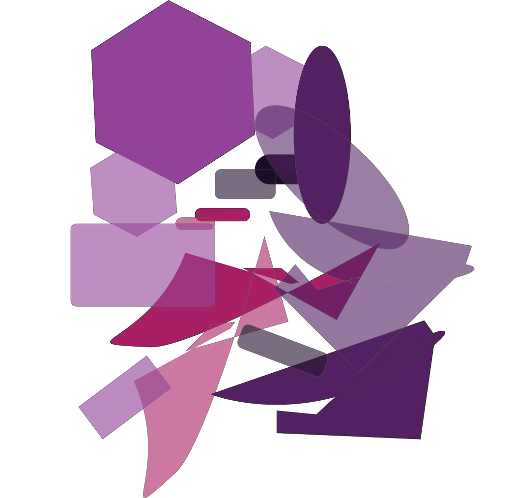
This is my project dealing with transparency. I feel as though I did well with the painting itself, and I thoroughly enjoy the colors that I picked, I think I also did well with showing transparency in the painting as well, especially in the lower half of the painting.
I love the color scheme you used! I think the transparency works best close to the center with the red violet and grayish violet. The movement of the animation has a very quick and glitchy feel. It looks like the animation is a little pixelated though, is that on purpose? I would improve by making the image a bit sharper that way!
ReplyDeleteThe variety of shapes looks really nice the combination of shapes with curves and shapes with sharp points creates an interesting contrast. A suggestion would be to maybe making some of the shapes more transparent to see more transparent colors.
ReplyDeleteThe bottom right section of shapes has the best transparency effect since the most objects overlap and actually show through another object in that part of your animation. As Laura said, the animation is rather glitchy - just slowing down one of the frames a second or two can add a better sense of progressing movement as opposed to jittering. I think the rough edges compliment your painting though; they look related as opposed to one having rough edges and the other having smooth ones.
ReplyDeleteYour process through transparency is nicely done through each step of the way. The video works very well because you have different opacities that overlap each other.
ReplyDeleteYour process through transparency is nicely done through each step of the way. The video works very well because you have different opacities that overlap each other.
ReplyDelete