https://www.youtube.com/watch?v=qkuBEcYXtCQ
My final project for color theory. For some reason, this project doesn't have color. I don't know if the file got corrupted or the layer with the color on it got deleted, but despite that it is animated and has audio. It also might be a bit of a tear jerker. Enjoy.
Thursday, April 28, 2016
Project 5 Color World


This is my flag and my color palette for project 5. I chose these colors because I felt that they represent me and what I was conveying in my piece. The rose is my favorite flower, and the yellow sparkles represent space, which I am in love with. The petals represent the wind and nature because I am an avid lover of the outdoors.
Friday, April 1, 2016
Project 4 Transparency
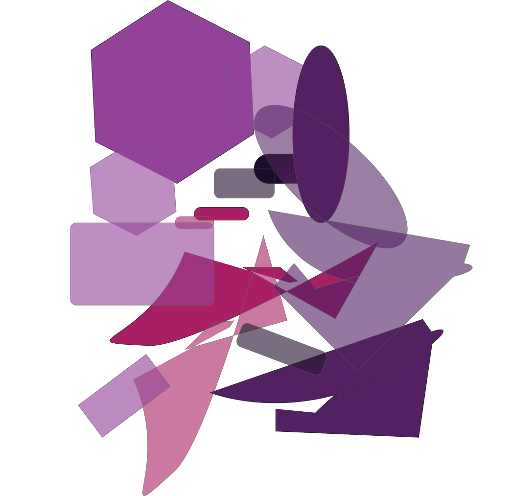
This is my project dealing with transparency. I feel as though I did well with the painting itself, and I thoroughly enjoy the colors that I picked, I think I also did well with showing transparency in the painting as well, especially in the lower half of the painting.
Thursday, February 25, 2016
Project 2- Vibrating Edges

This is my project dealing with vibrating edges. The colors are very trippy on my eyes so I can clearly see the edges of the shapes vibrating. I feel like the repeating background really helps with this idea too.
Thursday, February 18, 2016


Thursday, February 11, 2016
Munsell Advancing and Receding Colors


Monochromatic Painting and Color Wheel

Below is my color wheel chart, which displays gray scale and the tints and shades scale I used for my painting.

Subscribe to:
Posts (Atom)