https://www.youtube.com/watch?v=qkuBEcYXtCQ
My final project for color theory. For some reason, this project doesn't have color. I don't know if the file got corrupted or the layer with the color on it got deleted, but despite that it is animated and has audio. It also might be a bit of a tear jerker. Enjoy.
Thursday, April 28, 2016
Project 5 Color World


This is my flag and my color palette for project 5. I chose these colors because I felt that they represent me and what I was conveying in my piece. The rose is my favorite flower, and the yellow sparkles represent space, which I am in love with. The petals represent the wind and nature because I am an avid lover of the outdoors.
Friday, April 1, 2016
Project 4 Transparency
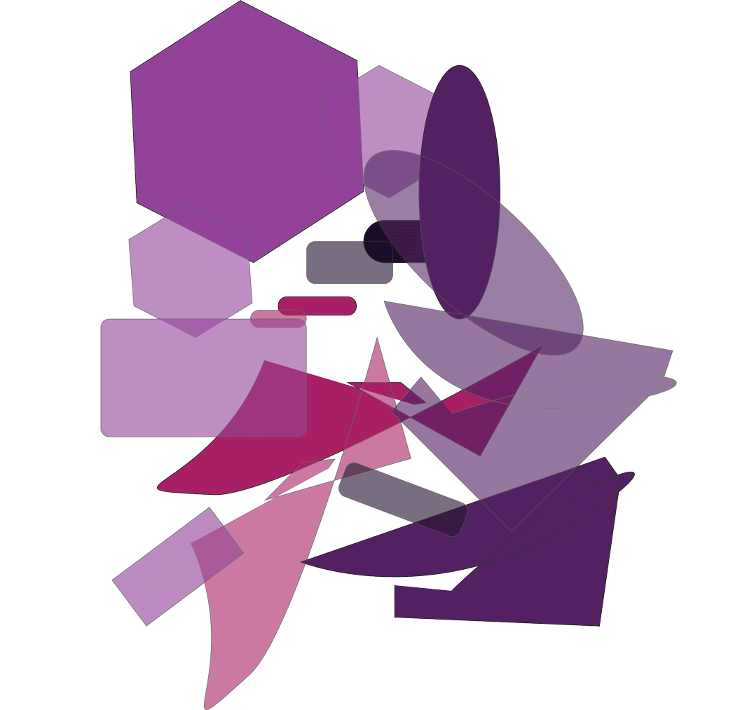
This is my project dealing with transparency. I feel as though I did well with the painting itself, and I thoroughly enjoy the colors that I picked, I think I also did well with showing transparency in the painting as well, especially in the lower half of the painting.
Thursday, February 25, 2016
Project 2- Vibrating Edges

This is my project dealing with vibrating edges. The colors are very trippy on my eyes so I can clearly see the edges of the shapes vibrating. I feel like the repeating background really helps with this idea too.
Thursday, February 18, 2016


Thursday, February 11, 2016
Munsell Advancing and Receding Colors


Monochromatic Painting and Color Wheel

Below is my color wheel chart, which displays gray scale and the tints and shades scale I used for my painting.

Thursday, February 4, 2016
Munsell Color Charts


Putting together these charts helped me understand color a little more. Some pieces are missing on some of the charts, but I was able to make it work. All in all I've learned more about value and chroma by doing this exercise than I would have on my own.
Monday, January 25, 2016
Interesting Color Use
Artists see the world differently than others. One of the main things I notice as an artist is color. Now, being self-taught, I've always drawn in black and white; I've never really experimented with color in traditional art (I've done some digital paintings before.) To teach myself more about colors and combinations of them, I watch a lot of cartoons and animations on the internet, being an animation major. In all the cartoons I've watched throughout the years, there are two shows that use color, and those are Steven Universe and Rick and Morty.
Steven Universe has beautiful color direction. Most backgrounds on the show are within the same three color pallets. I personally prefer the backgrounds with softer colors, such as this pink one.

And the Strawberry Battlefield, shaded with several shades of purple.

One of the most notable qualities of the backgrounds of Steven Universe are the direction of the clouds. Although they do not necessarily pertain to the subject of color, they are always pointing to the right. Of course, they are also shaded to fit the mood of the scene.
The other show that I am an avid fan of is Rick and Morty. Rick and Morty's art style is completely different from that of Steven Universe. I chose them because of that reason. The backgrounds and colors of this show are especially bright and wild and usually do not stick to a color pallet. For example:

The colors are all over the place in this show. Each color is completely contrasted from the others, giving it that "Rick and Morty feel." Here is another example of exaggerated color use.

The colors are of that on a rainbow. I think the contrasting art styles of these shows is what makes them so charming to me. They each have their own unique style and catch the viewer's eye to keep things interesting.
Subscribe to:
Posts (Atom)